Navigating around Ipiphany
The Home Screen
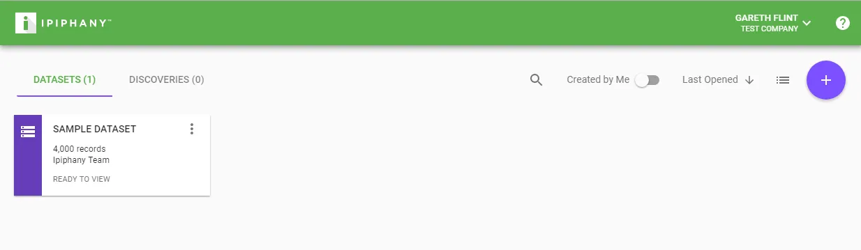
When you first login to Ipiphany you will be displayed the home screen. The home screen is where you access your Datasets and Discoveries.
To return to the home screen at any time simply click the Ipiphany logo.
Click a Dataset or Discovery to open it
To create a new Dataset click the ’+’ button when on the Datasets tab.
To create a new Discovery click the ’+’ button when on the Discoveries tab.
Within a Dataset
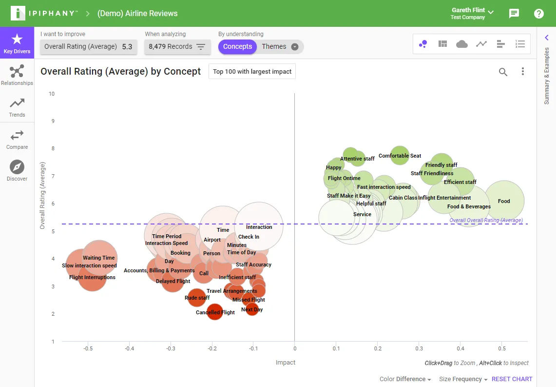
Key Drivers
Use the Key Drivers tool to find patterns that are having the most effect on the metric that you want to improve.
Relationships
Use the Relationships tool to find patterns that are highly connected. These are the things that are being talked about and, when looked at in a cluster, often uncover nuanced problems that could not be discovered via traditional analyses.
Trends
Use the Trends tool to find patterns that have changed over time. The trends tool contains algorithms to detect all kinds of emerging issues.
Compare
Use the Compare tool to contrast two or more groups to find out their biggest differences. A ‘group’ is simply a named set of filter conditions.
Discover
Use the ‘Discover’ tool to create Discoveries.
Changing Chart Type
When in Key Drivers, Relationships, or Trends you can change the type of chart by clicking the icons on the right.
Preview Panel
When you click anything in a chart or table the preview panel will pop out from the right. Use this panel to find out more about the pattern you selected and see verbatim examples.
User Interface Controls
Measure control (‘I want to improve’)
The measure control is used to set the target of your analysis. A measure is a combination of an attribute and a function. For example, if you want to improve your Overall Rating you would choose the attribute ‘Overall Rating’ and the function ‘Average’.
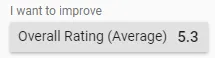
The number displayed to the right of the measure control is the overall figure for your measure.
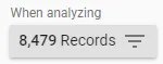
Filter control (‘When analyzing’)
The filter control is used to define the set of data you are analyzing. You do this by adding filters to your data. You can filter by a date range, search terms, text analytics attribute such as concept or theme, or by any of your imported fields.
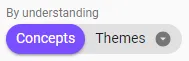
Dimension control (‘By understanding’)
The dimension control allows you to choose which text analytics or structured attribute you want to group the datasets records by.
Priority control
The priority control can be opened by clicking on the “Top X with…” button.
![]()
This will display a dialog where you can change the selection settings of the analysis.
Filter Chips
When you click a pattern in a chart, a filter will be added to the top of the preview panel. e.g.
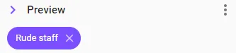
This is called a ‘Filter Chip’ and represents the pattern that you have clicked.
Filter chips can be:
- Removed by clicking the cross icon within them
- Right clicked to add to your ‘When analyzing’ Filter
- Right clicked to change how they are logically applied. When set to ‘Must Include’ or ‘Must Not Include’ they will change color.
This functionality is present wherever you see filter chips within the user interface.
Table column headings
Most table column headings can be clicked to sort the table by that column.
Some table columns can be clicked to change what is displayed in that column.
Search/Find control
Click the magnifying glass icon to search charts, tables and examples.
![]()
Most searches will search all items within your dataset, not just what is displayed on screen. The exception to this is the Network chart, searching there will highlight the pattern within the currently displayed results.