Performing your first analysis
1. On the home screen click on a Dataset

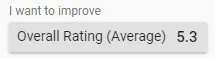
2. Select the goal of your analysis
3. View the Key Drivers to find patterns that are impacting the metric you want to improve.
You will be displayed the scatter chart. By default the Concepts with the largest impact on your goal are displayed as circles. The larger the circle the more it occurs (Frequency) The more red or green the circle is the further it is from the Overall Average (Difference)
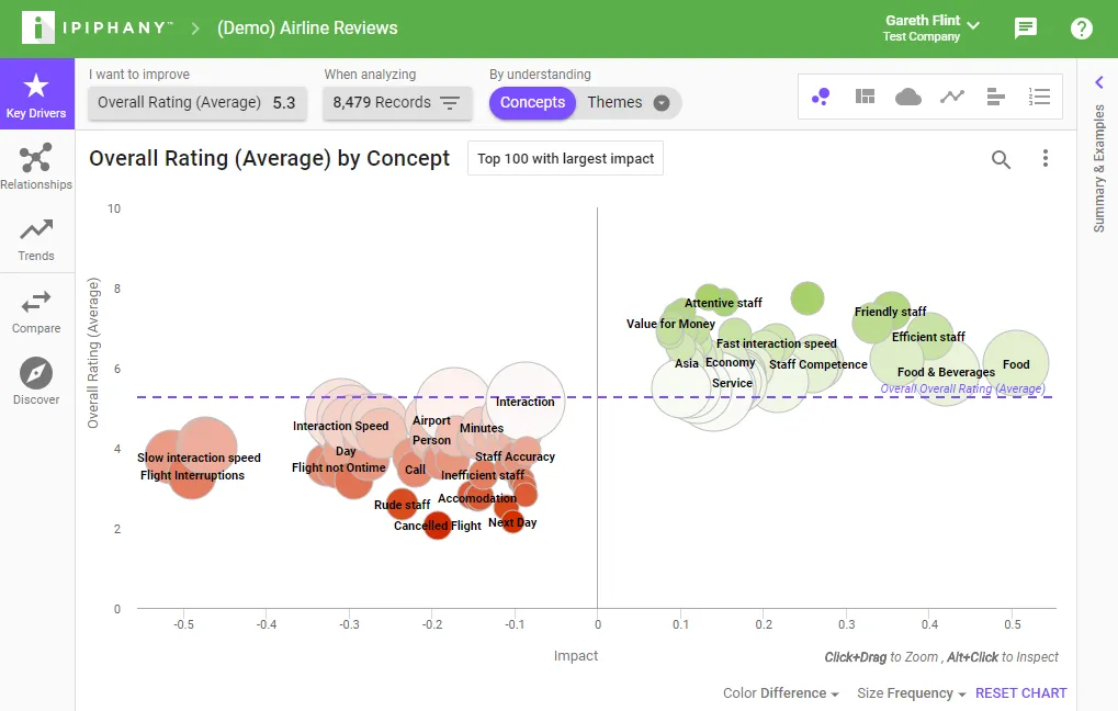
4.Click on a circle to inspect that pattern
Tip - Typically the best patterns to start with are large and bright red. This indicates a pattern that is having a very negative effect on the metric you want to improve.
5. Select the ‘Explain’ tab
On the right hand side select the ‘Explain’ tab to view a summary of what is talked about when the pattern occurs.
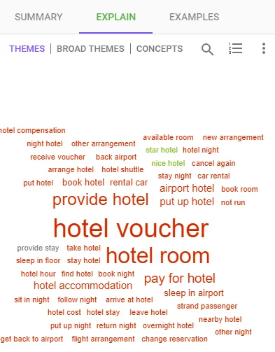
Click words in the Explain tab to view examples where these terms were mentioned.
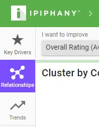
6. Click the ‘Relationships’ tool
Click the Relationships tool to find out what people are talking about.
You will be displayed the network chart. By default the chart is colored by cluster. Each cluster represents patterns that are frequently occurring together. By reading each pattern in a cluster you should get a good idea about what is being discussed.
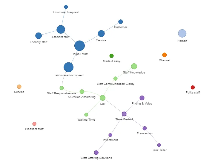
As always, click a pattern to view its details and see examples.
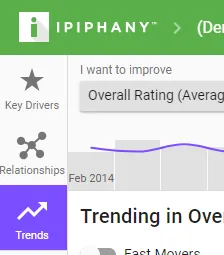
7. Click the Trends tool
Click the Trends tool to see what has changed in your dataset over time
You will be displayed a Trend chart and a Scatter chart.
The Trend chart plots your goal metric over time so you can see where it has increased or decreased. Click and drag on this chart to filter the results to just that time range.
The Scatter chart displays patterns that have changed the most in your selected time range. Patterns near the top of the screen have improved, patterns near the bottom of the screen have gotten worse.